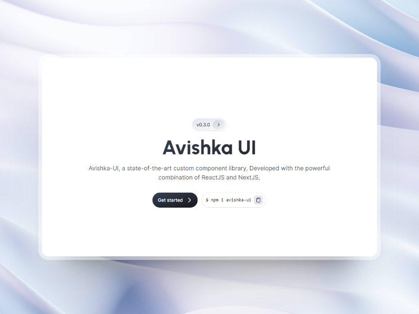
Avishka-UI is custom component library built with ReactJS and NextJS. In this post, we'll delve into the project's purpose and goal, web stack and explanation, problems and thought process, and lessons learned.
website
This is Official Website. your can read documentation.
https://avishka-ui.vercel.app
website Available in Package Manager
npm Package -
https://www.npmjs.com/package/avishka-ui
yarn Package -
https://yarnpkg.com/package/avishka-ui
Project Purpose and Goal
The purpose of Avishka-UI is to provide developers with a set of reusable components that can be easily implemented in their ReactJS and NextJS projects.
- Button
- Badge
- Avatar
- Image
- IconButton
- Alert
By using Avishka-UI, developers can save time and effort when building their projects, as they don't need to build these components from scratch.
Web Stack and Explanation
Avishka-UI was built using ReactJS and NextJS, two popular JavaScript libraries for building web applications. In addition, the project uses CSS and SCSS for styling, with the option to use either one depending on the developer's preference.
ReactJS is a powerful library for building user interfaces, and NextJS is a framework that makes it easy to build server-rendered React applications. Together, these technologies allow for the creation of fast, responsive, and dynamic web applications.
Problems and Thought Process
One of the main challenges we faced while working on Avishka-UI was publishing the project as an NPM and YARN package. This was our first time doing this, and we had to learn how to properly package and publish the project to make it available for others to use.
To solve this problem, we did some research and learned about the process of creating and publishing NPM and YARN packages. We followed best practices and made sure to test the packages thoroughly before releasing them
Lessons Learned
Through the process of building and publishing Avishka-UI, we learned a lot of valuable lessons. Here are a few key takeaways: - CSS and SCSS: While we had some experience with CSS, this was our first time learning and using SASS and SCSS. We learned about the benefits of using these preprocessors, such as the ability to use variables, mixins, and nested rules. - NPM and YARN: We learned how to create and publish NPM and YARN packages, which will be useful knowledge for future projects. - Building custom components: We gained a deeper understanding of how to build custom components in ReactJS, which will be useful for future projects as well.
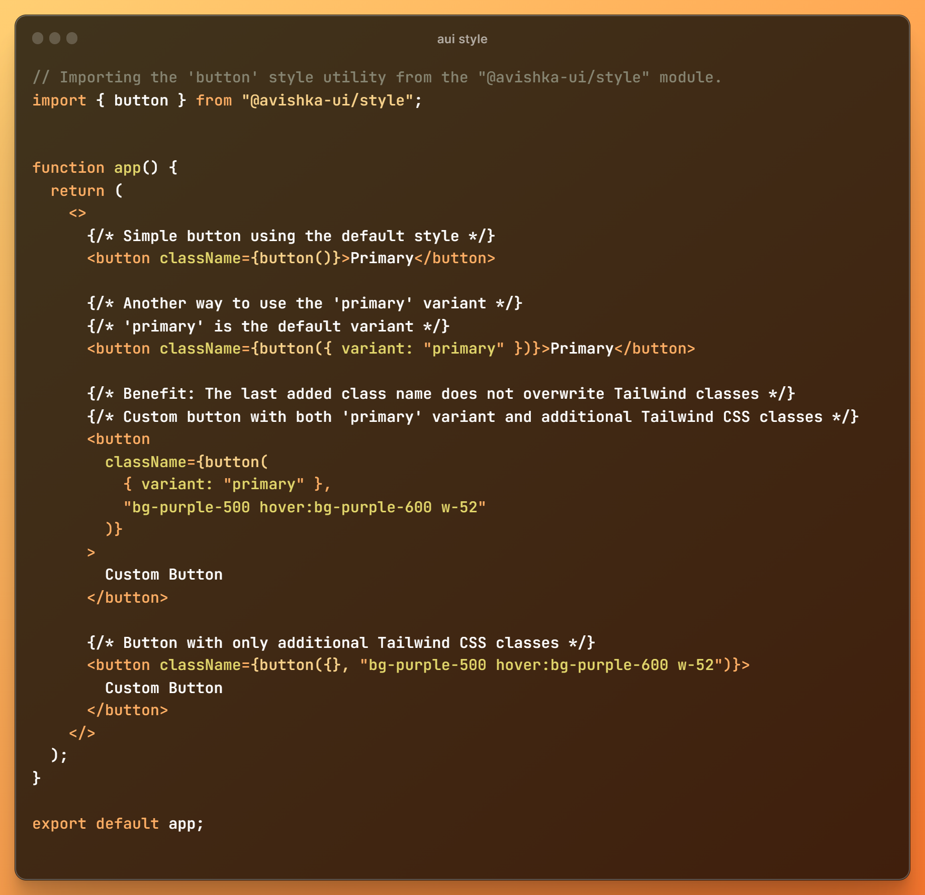
AUI-Style (Experimental)
AUI Style is revolutionizing component styling for React.js and Next.js projects. Now available as packages in the npm, yarn, and pnpm ecosystems. This experimental styling solution introduces a fresh and innovative approach to managing styles in your projects, providing enhanced flexibility and ease of use.
Documentation: Visit AUI-Style Documentation